MARGARET GARRISON

DeWalt Product Manual
UI, 2022
UI and market research.
Concept design for enhancing DeWalt end-user experience and product manual.
DEWALT is one of the worlds leading power tool brands. In a competitive industry, DEWALT needs to adapt to a younger customer who is more agile with technology, wants information faster, and wants to use their products to the fullest.
The DEWALT DCD797 manual is estimated to be 15 pages and is estimated to be translated in 16 different languages. Not only is this a significant amount of printing for just one product, but 75% of end users don't read the user manual.
This digital manual creates a globally accessible resource for end users and increases user experience with access to more information than they have in a paper manual. Only legally required material would be produced in a paper manual.
Problem Solving and Identifying Pain Points
PROBLEM 1: Only 25% of end users look at a product manual when purchasing a new product.
SOLUTION: Enhance user experience with digital platform. 80% of people 44 and under turn to online resources before opening a product manual.
PROBLEM 2: Only 50% of end users look at the product manual when troubleshooting.
SOLUTION: Product manual is easily accessible through a mobile device or tablet, all trouble shooting information is easily search-able through the app and can easily be updated with any new information.
PROBLEM 3: Unnecessary waste: DeWALT user manuals average 80% more pages than competitors, 20% more white space than competitors. The DCD797 manual is 15 pages and depending on the region, one manual can require as little as 3 languages or as many as 10. A manual could be as many as 150 pages in each unit sold.
SOLUTION: Digital manual reduces the amount of pages by keeping only legally required information in a printed manual equal to 4 pages.

Building the Wireframes
After identifying the user and company needs it was time to start building out a simple framework. The goal was to use the information hierarchy and order of information as the framework for the online manual regarding the product.
A few nuances for the online manual include creating a section dedicated to product and end user safety, making warranty information more prominent, adding a search engine for people to find information faster, and adding product overview videos into the "Operation" section.

Designing the Digital Manual
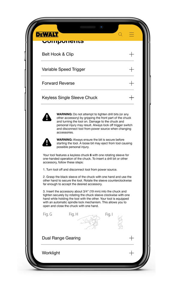
Existing brand fonts, typography, imagery, icons, logo and colors were used to adhere to brand standards. The app is designed to help users navigate to find information quickly without adding unnecessary haptics, colors, animations, effects, imagery or icons.
Information sections can be expanded or collapsed to reduce scrolling with a built in search engine for fast browsing.


View More


